I’m willing to bet that you’ve seen a map of the Earth before.
But I doubt that you’ve seen this one.
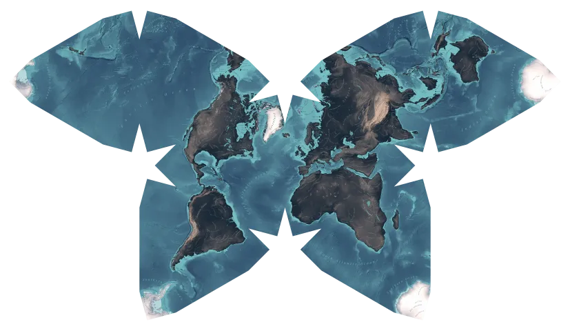
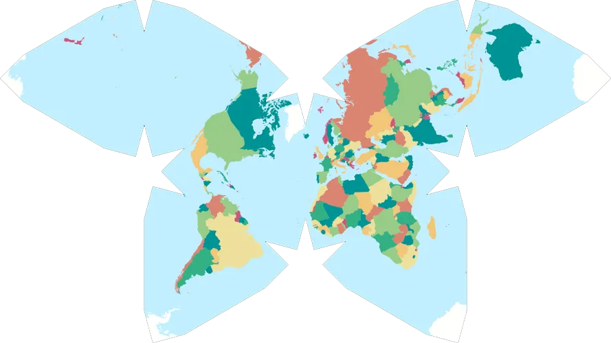
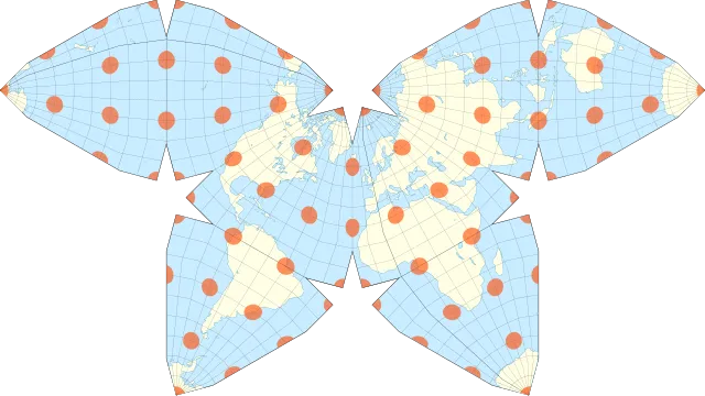
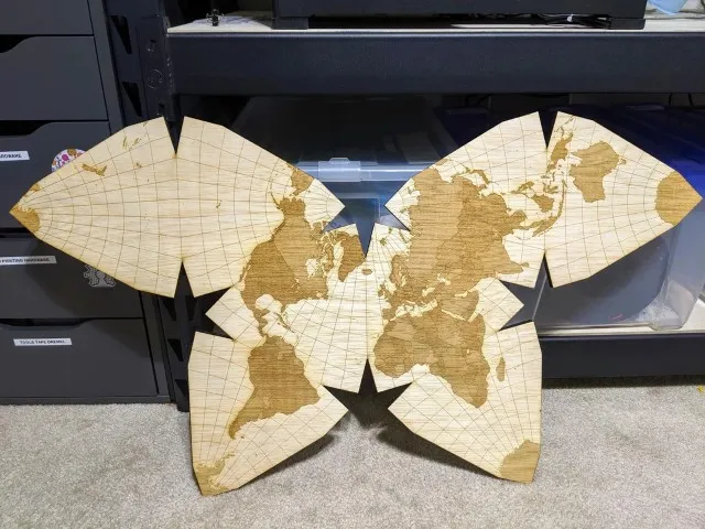
This is the Waterman Butterfly projection, an alternative map projection developed by Steve Waterman.
In my experience, most people’s first reaction to seeing the Waterman is “Wow, that’s so pretty!”, followed by “Wow, what a goofy and impractical map!”
However, I think that the Waterman is a genuinely useful projection, even with its drawbacks.
Advantages
Accuracy
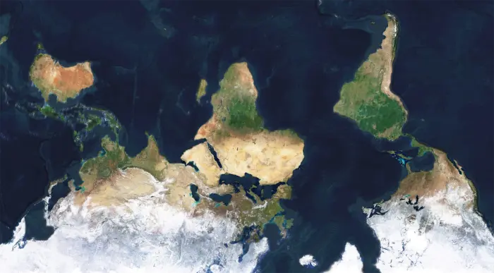
First, the Waterman is better at showing what landmasses actually look like.
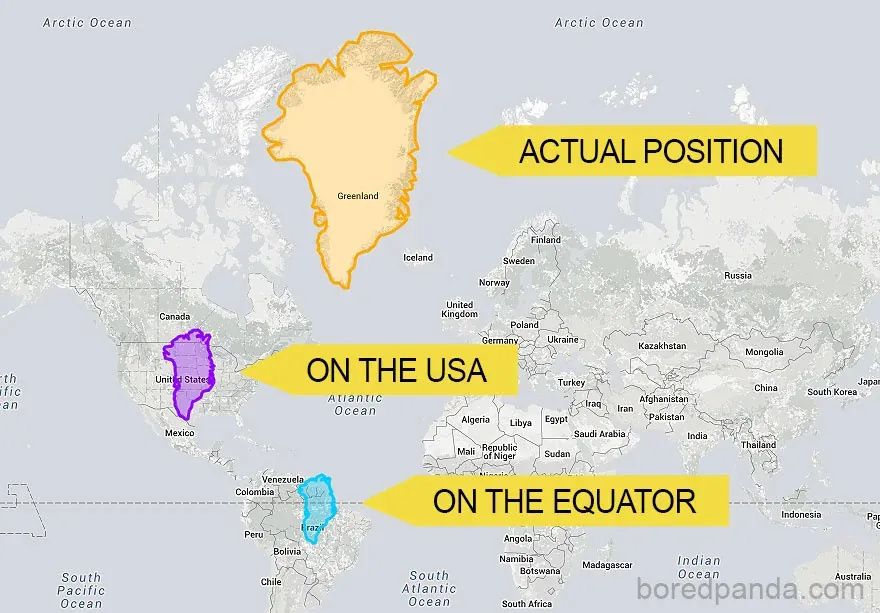
Most maps use the Mercator projection. However, because of the way that the Mercator works, landmasses further from the equator appear much larger than they actually are.
On a Mercator map, Greenland appears to be larger than the entirety of North America. In actuality, it’s far smaller.
As a consequence of being shaped like a butterfly, the Waterman uses a different and more accurate projection method (Polyhedra Packing via Isotropic Vector Matrix), and doesn’t have this problem.
Unintuitiveness
Second, the Waterman is not a rectangle, which makes it harder for people to develop a false intuition for.
This might sound unhelpful, but it just makes the Waterman more honest.
All 2D maps are inherently inaccurate; it’s impossible to flatten a sphere without compromising something.
Maps like the Mercator lull people into a false sense of understanding by being a simple rectangular shape. In reality, all maps (exception: globes) are geometrically deceptive, including Mercator and Waterman.
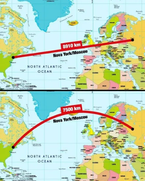
For example, the shortest path between two points on a rectangle is a straight line. And yet, the shortest path on a rectangle map is curved. Why? Because of complex geometry I don’t have time to explain.
By being in a butterfly shape, The Waterman is up front about its unintuitiveness.
People can clearly see that weird stuff is happening on the Waterman (e.g. the equator being four separate lines), which makes them wary about trusting its geometry.
Disadvantages
Wacky Equator
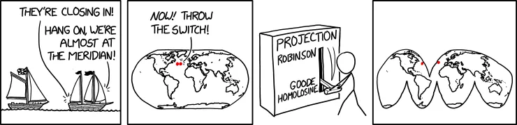
The equator on the Waterman is split into four separate lines that don’t touch. This means that if you were travelling from, say Macapá (Brazil, South America) to Libreville (Gabon, Africa), about halfway through the journey you would appear to teleport as you crossed a Meridian.
Relative North
Almost every map projection sets North as being in the upwards direction. It looks odd otherwise.
The Waterman (and the Dymaxion) don’t follow this rule. In the case of the Waterman, North is in the blank space near the top of the map.
Even weirder, the actual North pole is on the tips of the wings.
As mentioned earlier, this eccentricity can be an advantage because it makes people wary, but it can also just be unhelpful and inconvenient.
Conclusion
Perhaps you’re still unconvinced that the Waterman is a practical map. Maybe you’re right.
However, surely you can’t deny that the Waterman looks striking, elegant and interesting. It is the most beautiful map, and that makes it practical in its own right as decoration.
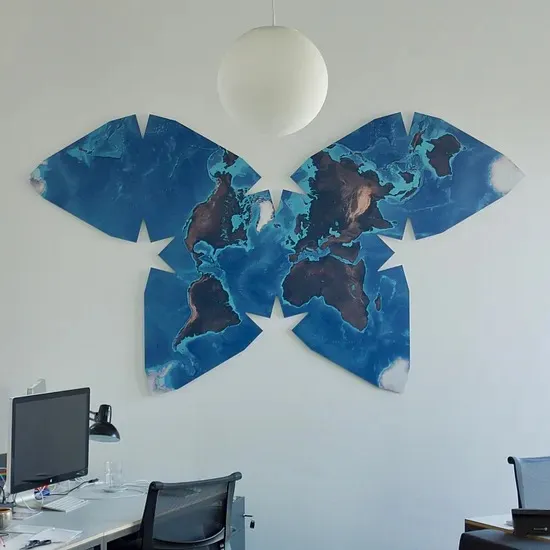
Most of the high-quality Waterman images suitable for printing (like the one above) are no longer available for download. I have a few of them on my computer, but the files are too large for me to host on this website. If you want one, get in touch and I’ll send it to you!
Sources:
- https://paulbourke.net/geometry/waterman/
- https://www.jasondavies.com/maps/waterman-butterfly/
- https://archive.is/eJwge
- https://archive.is/JH3zz
~Ethan