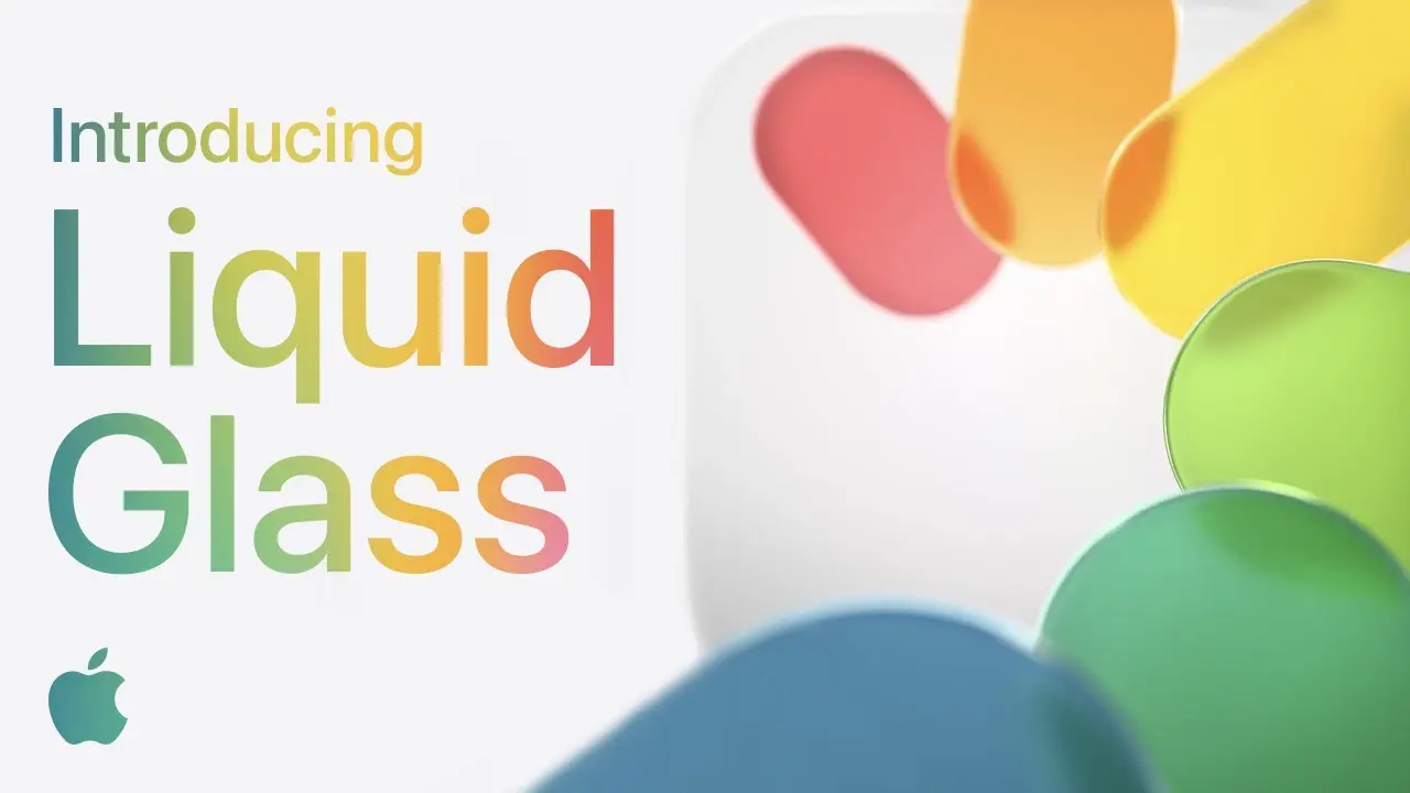
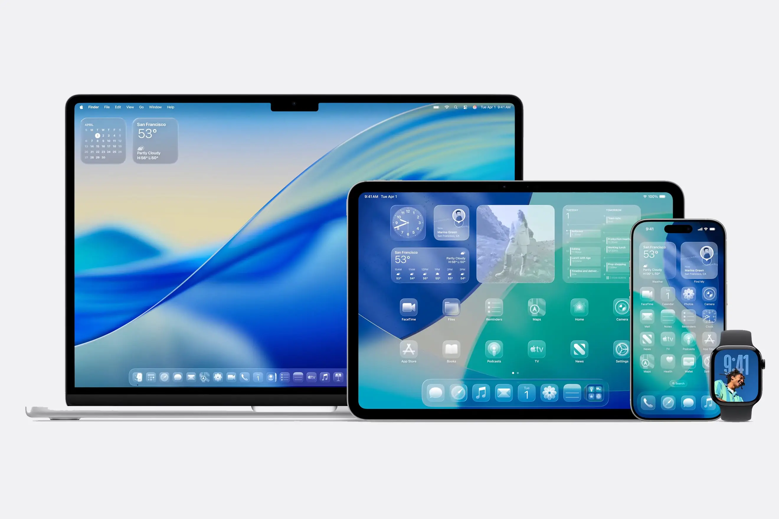
As part of WWDC25 on June 9, 2025, Apple unveiled their new Liquid Glass material and incorporated it into the design of the iPhone, iPad, Mac, Apple Watch, Apple TV, and Apple Vision.
For context, I’m not a huge Apple fan: I’m writing this on a Windows laptop, listening to music from my Android phone. I don’t dislike Apple, but I generally disapprove of the Apple ecosystem and don’t think that it’s right for me.
That being said, I absolutely love Liquid Glass. At no other point in time has my opinion of Apple been higher than when they showed off the new interface at the WWDC25 keynote. It’s not a perfect design, and it has some disadvantages, but it is a bold design choice by Apple that I’m delighted by.
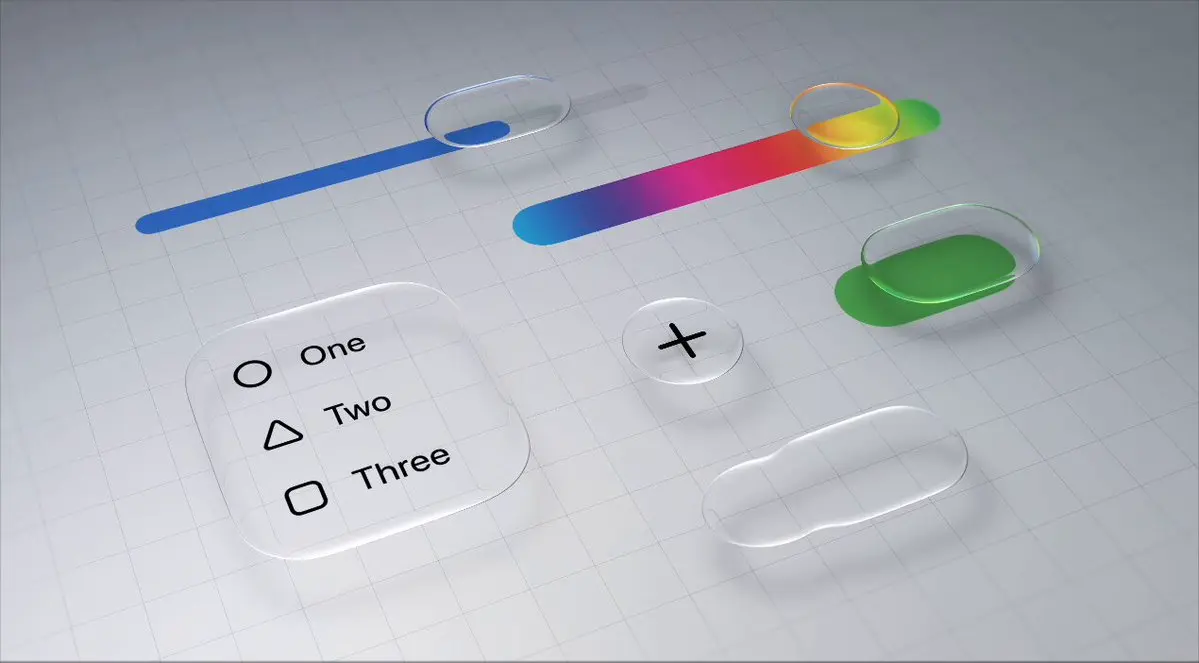
Glassmorphism
Liquid Glass is just the Applelogism (A portmanteau of Apple and neologism coined by me to describe Apple’s tendency to take popular existing concepts and rebrand them under a really generic Apple-ey name; see also Microsoft Excel and Apple Numbers) for Glassmorphism: a design philosophy that uses translucent blur effects to emulate frosted glass.
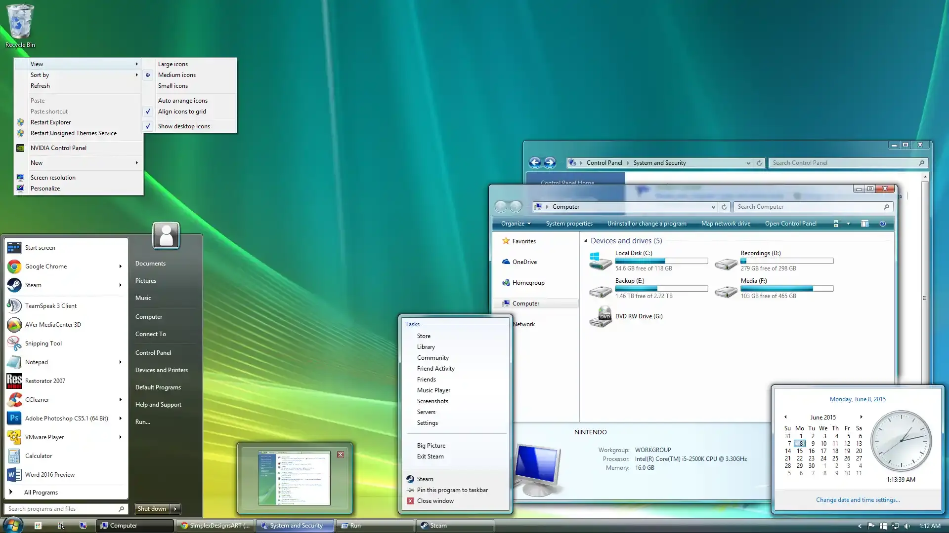
As many other people have pointed out, Apple absolutely did not invent glassmorphism. Frosted glass designs were first popularized by Windows Aero in 2007, and lots of other designers have used it since, including me!
This website (at least, as of the time of writing) features a glassmorphic header at the top of each page. The header has gone through quite a bit of iteration, but the frosted glass effect has been present from the very first design, created on April 11, 2025. Glassmorphism is one of my favorite effects, so I was absolutely delighted that Apple decided to implement it in the form of Liquid Glass.
Liquid Glass is Beautifully…
At its core, the only thing that Liquid Glass does is make the iPhone look prettier. It does a very good job of this.
…Novel
Liquid Glass is unique. Despite Windows Vista featuring glassmorphism more than 18 years ago, current versions of Windows use Fluent Design, which is the same boring Flat design language that pretty much every other interface uses.
Liquid Glass is a splash of colour (or lack thereof) in a sea of bland minimalism.
…Futuristic
Liquid Glass feels futuristic. See-through displays are featured so prominently in sci-fi settings like Avatar that we tend to associate transparent displays with futuristic technology. A smart phone with Liquid Glass feels much closer to Tony Stark’s phone than a smart phone without it.
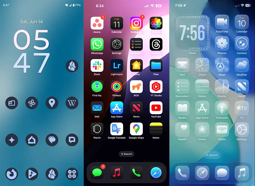
For example, consider the image above. On the left is a screenshot of my phone running Android 14, in the middle is a phone running iOS 18, and on the right is a phone running iOS 26. Of these three, which one looks most like something you’d find in a sci-fi movie? The answer is unambiguously the phone on the right. However you feel about Liquid Glass, you can’t deny that it looks straight out of Black Mirror. In a good way.
…Animated
Third, Liquid Glass is, well, liquid. It moves and behaves organically and realistically. For example, if two buttons made of Liquid Glass merge into one, they coalesce like real blobs of liquid (the way the blobs merge reminds me of object blending via ray marching, although apparently Apple actually used signed distance field interpolation for the Fluid Morph effect, not ray marching). Because Liquid Glass imitates real-life fluid dynamics that we understand intuitively, it feels responsive and dynamic in a way that is pleasing to use.
…Light Bending
Liquid Glass bends light like a prism. I find it difficult to describe how cool this is to me.
I understand how Apple did this from a technical perspective. I understand their colour dispersion and luminal refraction techniques. This is still one of the most impressive and coolest interface effects I’ve ever seen. Even if Apple had just straight-up lifted Windows Aero without making any modifications except for adding this prism effect (to be clear, they absolutely didn’t do this), I would still think that Liquid Glass was awesome.
Liquid Glass is Problematically…
Despite its aesthetic appeal, Liquid Glass does have a significant amount of problems that the internet has discussed in depth.
…Performant
Liquid Glass is composed of many different effects, but the most important is the Gaussian blur that gives it that blurred frosted glass effect.
For example, in the photo of Apple Park below, the left half is unmodified while the right half has been filtered through a Gaussian blur.
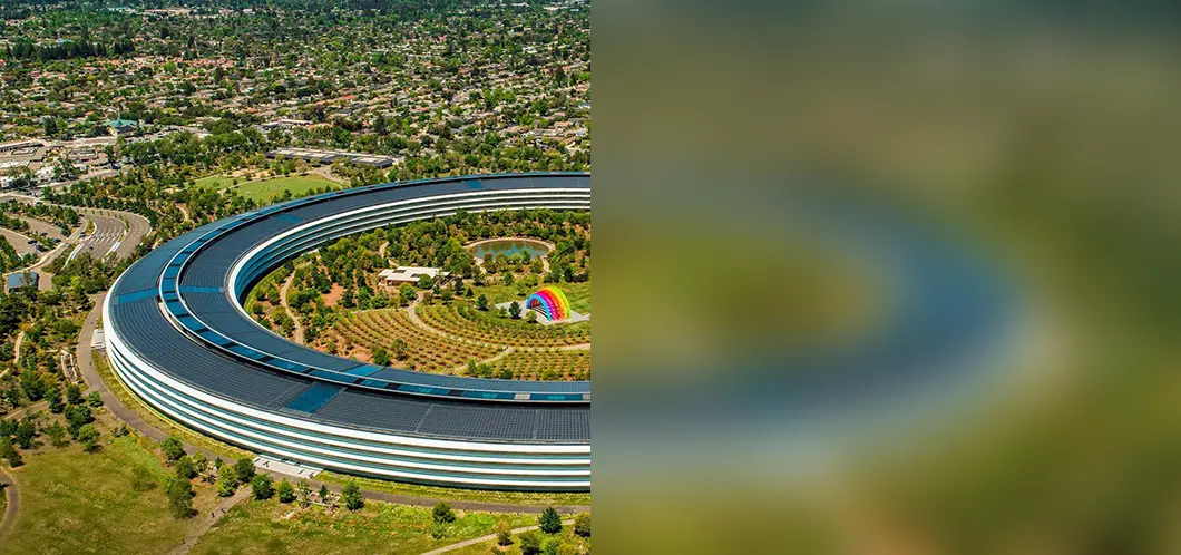
From a technical perspective, a Gaussian blur is a method of making each pixel have an influence on the pixels around it, which causes the colours to average out into a blurry definitionless blob. What this means is that the computer needs to perform a mathematical function dozens or hundreds (eyeballing it, Liquid Glass has a blur radius of 6 pixels, meaning it has pi*6^2 ≈ 113 pixels around it) of times for every single pixel, of which there are millions (iPhone 16 has a 2556x1179 screen, so 3,013,524 total pixels), and you need to do this once per frame, of which there are ideally 60 per second on the iPhone 16. This adds up to a huge amount of computation, and it doesn’t help that the 2D Gaussian function isn’t exactly simple.
In other words, Liquid Glass absolutely requires a powerful processor, which in turn requires a lot of electricity. In my opinion, a lot of the concerns about Liquid Glass are being overstated, but this one is definitely not. From programming my site header, I know firsthand how taxing Gaussian blurs are; incorporating a bunch of layered glassmorphic panels is a performance nightmare that will and already is causing problematic battery drain on devices that really ought not to be running out of battery (e.g. watches), especially not on something as trivial as the interface.
Apple has cleverly alleviated some (but not all) of their performance woes by inventing their own patented black-magic approximate gaussian blur that, first, is miraculous and deserves more praise than it gets; second, significantly speeds up compute time via aforementioned black magic; and third, is highly optimized for Apple Silicon GPUs.
Even with Apple’s optimization, Liquid Glass still uses a significant chunk of an iPhone 16’s graphical processing power, and there truly isn’t anything that could possibly be done to fix that. Gaussian blurs are inherently computationally expensive by their very nature.
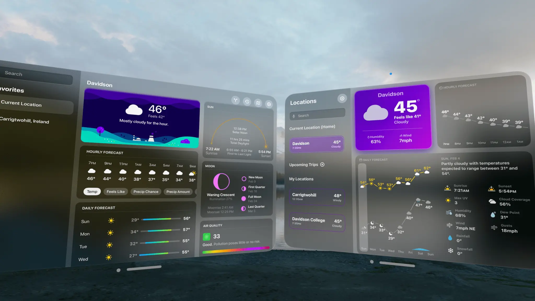
…Readable
Something you almost never notice is that, no matter the format, the text you read always contrasts with its background. This site uses a dark theme, so the text is white. Paper books are made of white paper, so the text is dark. Contrast is one of the most important qualities of a usable design: without enough contrast, our brains’ visual system has to expend extra effort to detect the edges of each letter, something not ideal in an activity like reading where you have to parse hundreds of tiny glyphs almost instantly in order to allow sufficient time for your brain to actually process what it’s read. If you want people to be able to read text, you have to make sure that the text contrasts with its background. So why in the world would you make the background transparent!?
This isn’t a problem for subtle transparency, but Liquid Glass is almost completely transparent. If the content behind the Liquid Glass is the same colour as the text on the Liquid Glass, this means that the meager opacity provided by the Liquid Glass doesn’t give enough contrast to the text to make it legible.
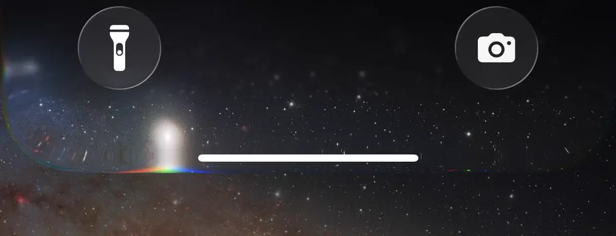
For example, try to read the text at the bottom of the iOS 26 screenshot above. Can you read it at all? How long did it take you? Text should be instantly readable, and 3% contrast between text and background is not even close to enough.
Apple claims that Liquid Glass dynamically adapts to the content behind it, but this clearly isn’t quite working yet. It’s important to remember that iOS 26 is still in a public beta and these concerns will probably be addressed before it’s fully released, but as it stands this is a huge usability issue that needs to be addressed sooner rather than later.
Conclusion
I’m still delighted by Liquid Glass. It has its share of critical flaws, but it still remains a stunningly sleek modern design. It’s unique, futuristic, reactive, and bends light like a prism. Apple still needs to fix the adaptive text and also invent computronium to solve their readability and performance issues, but I’m sure they’re working on it.
Compared to Google’s new design language, Material 3 Expressive, I think that Liquid Glass looks far cooler. I still prefer the playful utility of Google’s design philosophy, but Liquid Glass has an undeniable appeal that fits Apple’s philosophy of ‘you live in the future now; things just work’.
This has been my longest blog post by far, and I’ve really enjoyed writing and researching it. It’s been interesting to experience firsthand the amount of effort that goes into writing a technical blog.
I hope you found this post interesting!
~Ethan