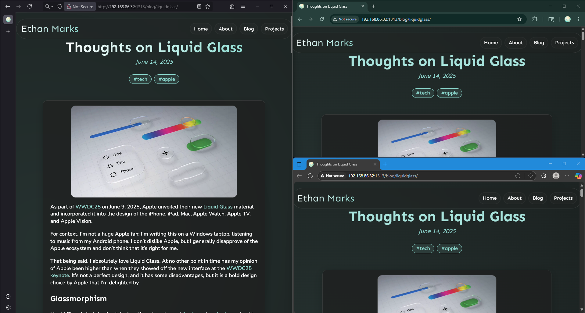
Earlier today, I opened my personal website in Google Chrome for the first time and had to work around a browser compatibility bug that’s older than I am.
As a long-time Firefox user, I’d never even thought to test my site in another browser. The only reason I was using Chrome was because I was trying to work around another compatibility bug. It all started with my laptop. My laptop is fairly powerful, which means that it’s heavy and has an abysmal battery life. Because of this, I use a laptop dock to effectively turn it into a desktop with a built-in keyboard. I’d like to be able to code from places other than my desk, so I’ve been considering buying a cheap portable laptop with just barely enough processing power to run a browser, and using a remote tunnel to puppeteer my main laptop that has all of my files on it. The best way to do this seems to be vscode.dev, so I decided to try it out and see if it was viable. I booted up the webpage in Firefox, aaaaand it doesn’t work.

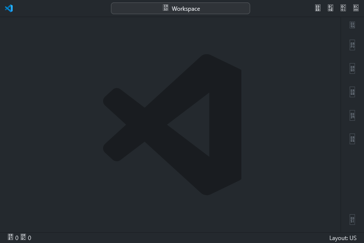
Firefox has trouble with icon fonts, so all of the interface buttons were replaced with empty boxes. After an hour of trying to fix it, I just gave up and used another browser. Much as I dislike it, Google Chrome is less buggy than Firefox and has more support for new browser technologies (like CSS carousels), so I grudgingly conceded that it’s fine for just running a web app. I installed Chrome, navigated to vscode.dev, and it worked perfectly. I’m still very impressed that Microsoft managed to make a browser port of an entire code editor.
I logged into my GitHub account, did some configuration, and started coding. I started up my personal website’s Hugo server and opened it in a new Chrome tab. At that point, I discovered that portions of my website were invisible.
I opened the page on Firefox, and it looked fine, so I deduced that the problem was browser-specific. I started troubleshooting. I disabled likely-looking CSS styles at random until something changed, and eventually realized that I could make the text visible by unchecking the webkit-text-fill-color: transparent; style. Although this made the text visible, the resulting text was pure white rather than my mint gradient. I eventually realized that the problem was in how the two browsers handled the background-clip: text; style.
What background-clip: text; does is makes it so that the background of an element (in this case, the background is the mint gradient) is only visible in places where the text is. It’s as though there was masking tape everywhere except for the text.
On Firefox, all text contained within a background-clipped element is considered part of the background clip. It doesn’t matter if that text is the direct content of the element or it’s inside some nestled spans: it’s all considered part of the parent element. On Chrome (and Edge, Opera, Brave, Vivaldi, etc), this is not the case. The text must be the direct content of the element; otherwise, it isn’t counted. Each word in the text “Welcome To My Personal Website” heading was contained in a separate span, so Firefox counted the text as part of the parent element while Chrome did not.
I looked into ways to fix this, but all of them either ruined the effect or just didn’t work. Each word has be in a separate span for the staggered animation to work, and setting the gradient effect at the span level would cause the gradient to only cover that one span and then start over for the next one; what I want is for the gradient to smoothly fade across the whole element.
In the end, I settled on just using a solid mint colour by default, and adding a -moz-document class (which only works on Firefox) that sets the mint gradient. This way, Chromium browsers ignore the code inside the -moz-document and get solid colour, while Firefox reads it and gets the gradient.
h1 {
    color: var(--color-h1);

    @-moz-document url-prefix() {
        /* Add a cool gradient on Firefox; other browsers don't support it :( */
        background: var(--color-gradient-mint);
        background-clip: text;
        -webkit-background-clip: text;
        -webkit-text-fill-color: transparent;
    }
}
The solid colour isn’t too noticeable, but it definitely doesn’t look quite as nice on Chrome or Edge as it does on Firefox.

Then I checked to see if anyone else had noticed this. I found a Stack Overflow post. The author of the post, Paul Stephen Davis, noticed the background-clip inconsistency while working on his photography website and asked for help. A user named Jason suggested using display: inline; (which doesn’t fix the bug) and then gave up.
This was over 6 years ago. background-clip was first introduced by WebKit in 2008, and has been supported by Chrome since 2010. It has been a standard CSS property for a decade and a half, and the Stack Overflow post proves that this bug has been known since at least 2019.
I think that Firefox’s implementation of background-clip is much better, both in principle and in what it allows you to do. Chrome apparently doesn’t agree, and has spent the last 15 years being wrong.
Please fix it, Google.
~Ethan